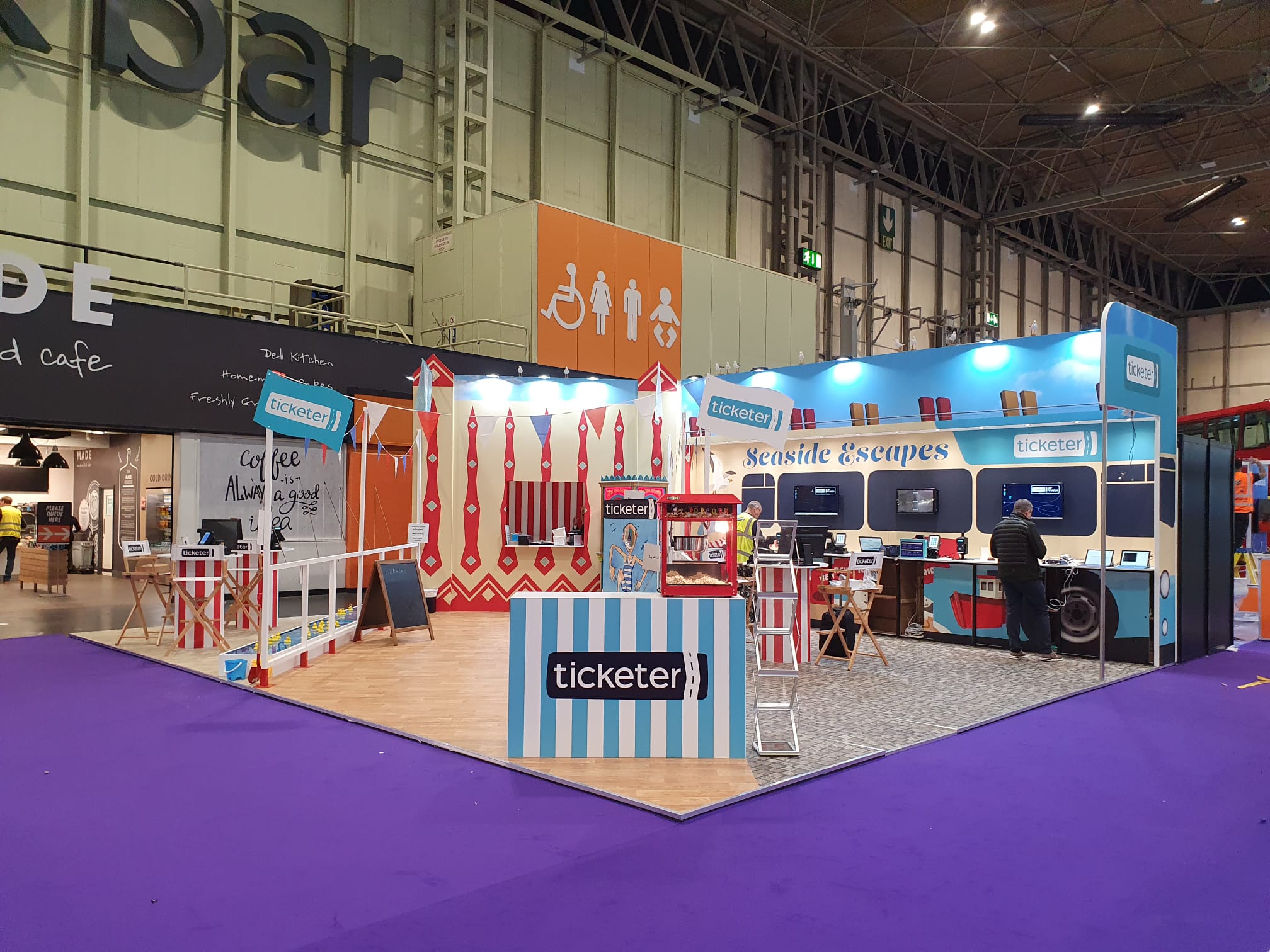
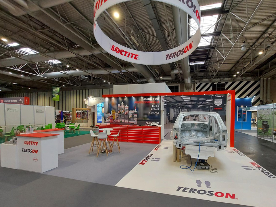
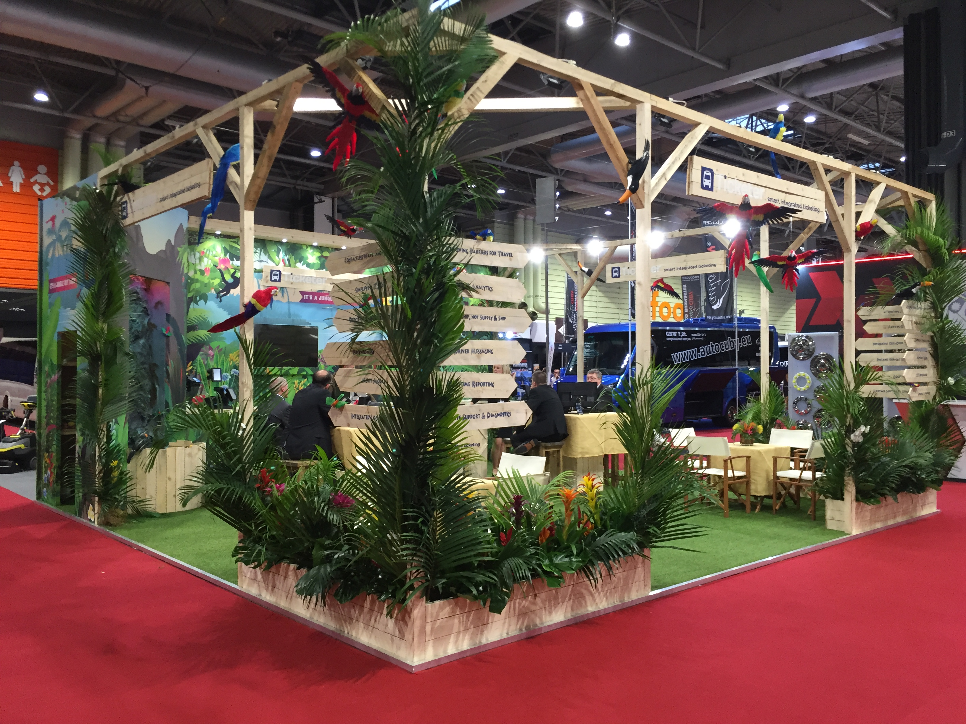
First impressions always matter in the design of an exhibition stand, and the colour is often the very first thing attendees notice. Colours evoke emotional responses, shape perception, and play a critical role in the fast-paced world of exhibitions. Colour psychology is at the beginning of how visitors interact with your stand.
When colour is used thoughtfully throughout the exhibition stand, it doesn’t just look good, it’s a powerful communication tool that draws attention and sends a clear message, which drives interaction with all visitors.
In this blog, we explore the different colours which can be used in your bespoke exhibition stand to bring an effective presence to the event you are exhibiting at.
At Expositionists, we know how important it is to represent your brand colours through your exhibition stand, while ensuring your commercial goals are supported and enhanced through strategic colour choices.
Why Using Colour In Exhibition Stands Matters
Exhibition events are busy places, which is why you need your stand to attract attention. Colour plays a major part in the appearance of your exhibition stand and can grab attention from the other side of the hall, create an emotional connection with your brand, reinforce your brand’s identity, and influence visitors’ interaction.
What the Different Colours Mean
Behind each colour lie different emotional and psychological responses. Colours have the power to shape our thoughts, emotions and reactions, making them a vital element in creative design, especially exhibition stands. Think beyond your brand’s primary colour palette and enhance it with additional colours that can be used in graphics and signage.
Using the colour wheel can help you find the right colour combination for your exhibition stand. Opposites attract, as they say, so choose two colours opposite on the colour wheel for a bold vibe, for something more subtle and calming, opt for hues next to each other.
Black – Powerful Strength with a Luxurious Feel
The colour black is known as a powerful hue, evoking exclusivity, formality, and strength. It’s the colour to use when designing luxury branding or when you want a sleek, high-end aesthetic. Balance this dark hue with lighter accents to avoid making your stand feel closed off.
Nardi Exhibition Stand
Seranit Exhibition Stand
Anticcuir Exhibition Stand
Red – Energetic & Passionate
Red is bold and demands attention, which is why it’s a powerful colour to use for your exhibition stand, whether for the text or highlighting logos and photos. The deep colour raises energy levels and creates a sense of urgency; however, use it in moderation, as too much red can feel overwhelming. Red always creates an exciting atmosphere and one that will stand out.
White – Clean, Simple, Spacious
White is pure, a hue that suggests security and comfort. It is one of the most common colours used. The light and airy quality of this colour makes it perfect as a backdrop for minimalist stand designs with high-contrast colours popping out.
Blue – Trusting & a Calm Presence
Blue has a calm presence, which indicates that the company is stable and loyal. You will normally see accents of blue on finance, tech and healthcare stands. It’s a colour that has the same benefits as black but with a wider variety of shades, which can be layered. This calm atmosphere will encourage visitors to linger.
Green – Growth Combined With Wellness
Green is related to nature and other health benefits. It is such a comfortable colour and a good choice for eco-conscious exhibition stands. Green can be layered to create a relaxed and positive feeling. Use tone-on-tone greens, with lighter greens suggesting serenity, and darker greens feeling more traditional and stable.
Nah Foods Ltd Exhibition Stand
Yellow – Welcoming & Warming
Yellow represents the bright sun, which makes us cheerful and elevates the mood of those in its presence. It is ideal for creating a welcoming space. Due to the brightness of the colour, a lighter shade can be just as effective without overstimulating the stand’s design.
Purple – Creativity, Royalty & Pure Wisdom
Stand out from the crowd and make a lasting impression with the elegance of purple. A colour that blends the stability of blue and the energy of red, producing a royal colour that adds respect to your company values. Combine it with colours such as blue and yellow to accentuate its luxurious depth.


How to Use Colour Effectively
Below, we have put together some tips to show you how you can use colour effectively in your stand design.
- Highlight colourful key features with lighting
- Create a contrast through the design, highlighting the different key areas
- Layer the tones of each colour according to the importance of each part
- Don’t overwhelm the space with too many bold hues
- Lastly, test your colour palette under exhibition lighting to really get the feel of it
Matching the Colours to Your Brand & Goal
Exhibition stands are all about promoting your brand awareness to your audience. Your colour scheme should align with your identity, the goals you want to achieve and the audience you want to target. You should always include your brand palette in your exhibition stand design and build up the colours around it. For example, if your logo is green, introduce natural textures to enhance its organic feel.
- Is your exhibition stand to launch a new product?
- Are you trying to generate more leads by presenting yourself at an event?
- Do you want to appear trustworthy and luxurious to your audience?
- Who is your ideal visitor, and what colours would appeal to them?
Ask yourself these questions to reflect your brand and entice your visitors.

Continued reading:
How Do You Know if Your Exhibition Stand Was a Success?
Common Mistakes to Avoid When Designing Your Exhibition Stand
The Exhibition Stand Trends for 2025 & the Ones We Leave Behind
10 Top Tips For First-Time Exhibitors
Understanding the psychology behind the different colours allows you to create an exhibition stand that attracts and engages your audience members. Every colour choice shapes the visitor experience, and getting it right is the key to being successful at an exhibition show.
Our team of experienced designers can help you create the space your brand needs, combining strategy with creativity. Contact us today for more information.


